A study in color
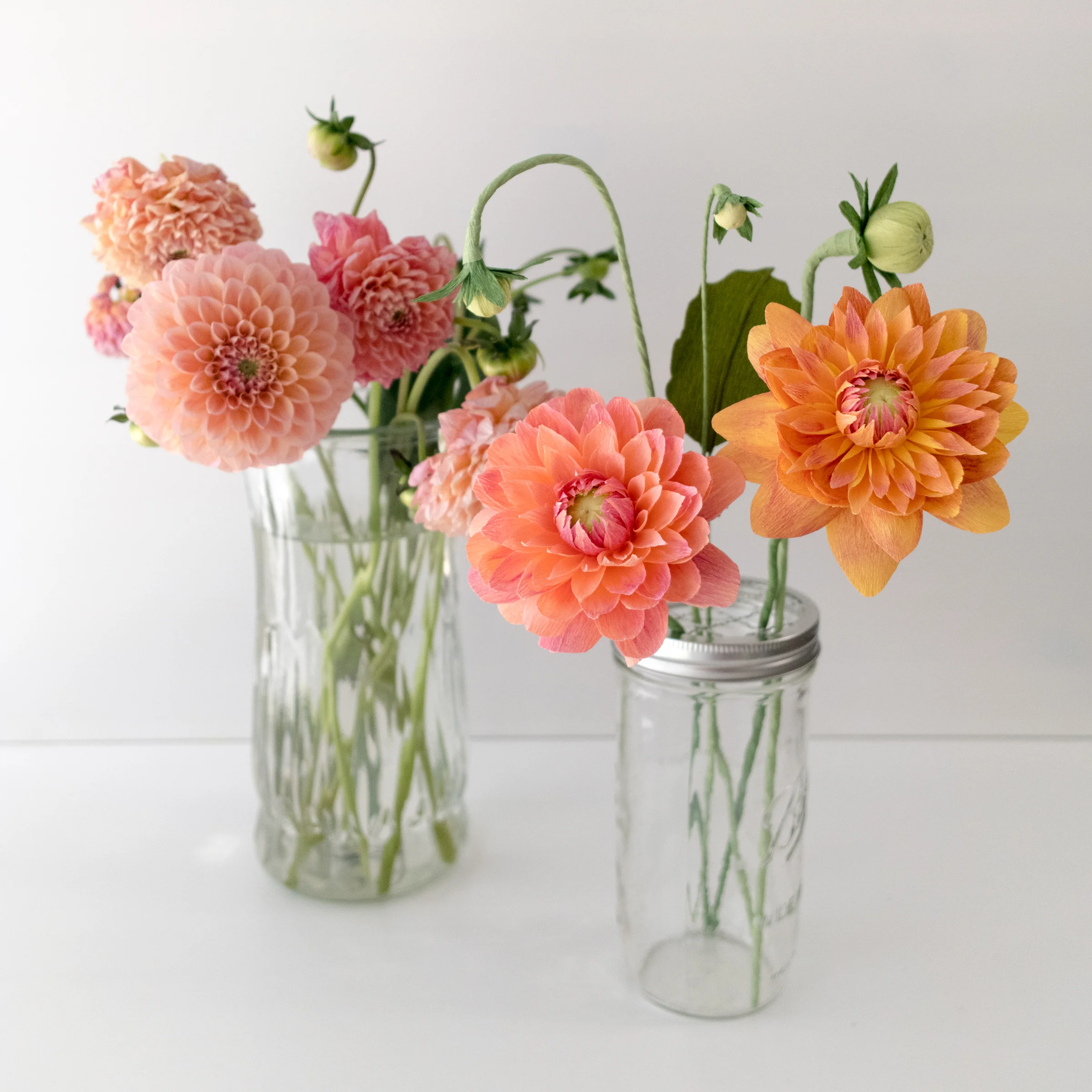
Over the weekend my husband and I were wandering through the produce section of the grocery store wondering what to make for dinner that night (as we do) when my eyes started to drift towards the flowers (as they do). I quickly darted to the display to grab one lone little bundle of the most adorable dahlias—just sitting there neglected in a stray bucket. By far the best thing I've seen at a grocery store in a while!
Later that night, I took a little mental break from the custom orders I'd been working on to see if I could find a way to recreate the gorgeous glow of these dahlias. The blooms had two different palettes—one was more of a purple to coral-pink, the other moved from a fuchsia to a yellowy-coral color. I should have taken a photo first thing the next morning because by the time I got around to shooting my side-by side their color had faded a good bit. But, I think I was able to capture these hues pretty well.
I used my favorite type of crepe—doublette—and shaded the sheets with a magenta pan pastel. At first, on the yellow sheets, this looked a little harsh, but I love how the streaks turned out, and tonally the results are perfect.

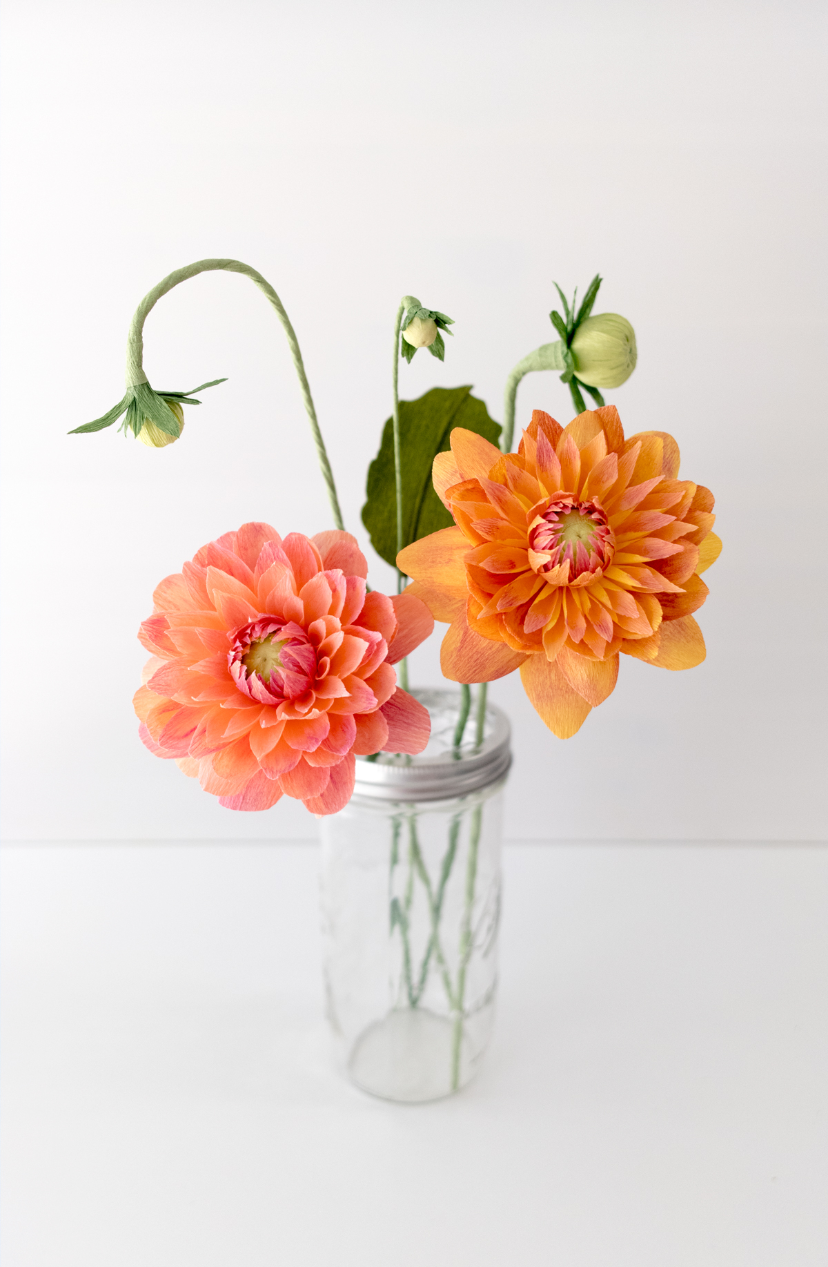


Since I had several orders going out this week, I didn't want to spend ages being super precise with the rows and rows of tiny petals like this variety of dahlia. I was much more focused on the color, and then I became just as concentrated on the buds! I love how quirky these pieces are, and I think they completely make the arrangement.
I added this piece to my set of Studies this morning, so if you want to keep a little piece of summer in your home year-round—grab it while you can! I'll include a printed photo of my side-by-side comparison for you to have with this one too.
I know this is only week two of hitting my study-a-week goal, but I'm feeling confident. So, I can't wait to see what I come up with next week. Until then!